Project Team 13: Topic: Global Patterns in Alcohol and Mortality, COSI 116A F24
Mackenzie Chung, Debbie Engelberg, Noam Reiner, Cameron Sherman
Project-long Course Project as part of COSI 116A: Information Visualization, taught by Prof. Dylan Cashman, Brandeis University.
Motivation
Alcohol consumption is a significant global health concern, often cited as a leading risk factor for numerous medical conditions and social issues. From a young age, we are taught about the dangers of excessive drinking and its potential to lead to addiction, liver disease, mental health disorders, and even premature death. Yet, the true scope of its impact on global mortality and its comparison to other leading causes of death is often less understood. This gap in understanding inspired our team to delve deeper into the correlation between alcohol consumption and death rates worldwide.
We set out to answer critical questions: How does alcohol-related mortality compare to other common causes of death? Is the narrative around alcohol consumption's dangers as dire as parents and educators suggest? Additionally, how do these risks vary across different countries and over time? To address these questions, we created a series of visualizations aimed at individuals of all backgrounds who are curious about the broader effects of alcohol consumption.
Our visualizations allow users to explore data on alcohol consumption, death rates, birth rates, and causes of death interactively. Users can observe patterns across different years and regions, enabling them to draw informed conclusions. Through this experience, we hope to provide valuable insights into the complex and often overlooked impact of alcohol on global health.
Demo Video
The video below walks through the process of creating our project: From planning out what issues we aim to research and tackle,
to gathering the data and drafting up sketches for our final designs. It also shows the final product of our visualizations and how users can interact with them.
**The actual demonstration for each visualization starts at 5:16.
Explanation of Visualizations
There are 3 different visualizations that users can explore which are all found under the drop-down menu for "Visualizations:
Brushing & Linking
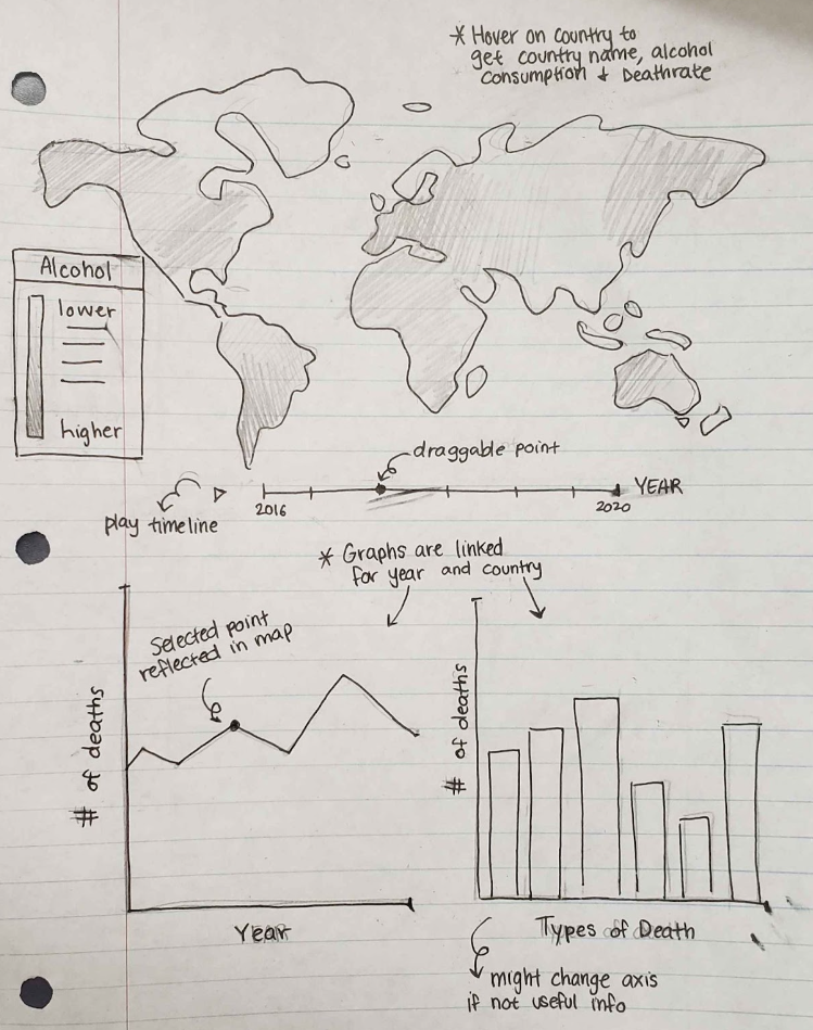
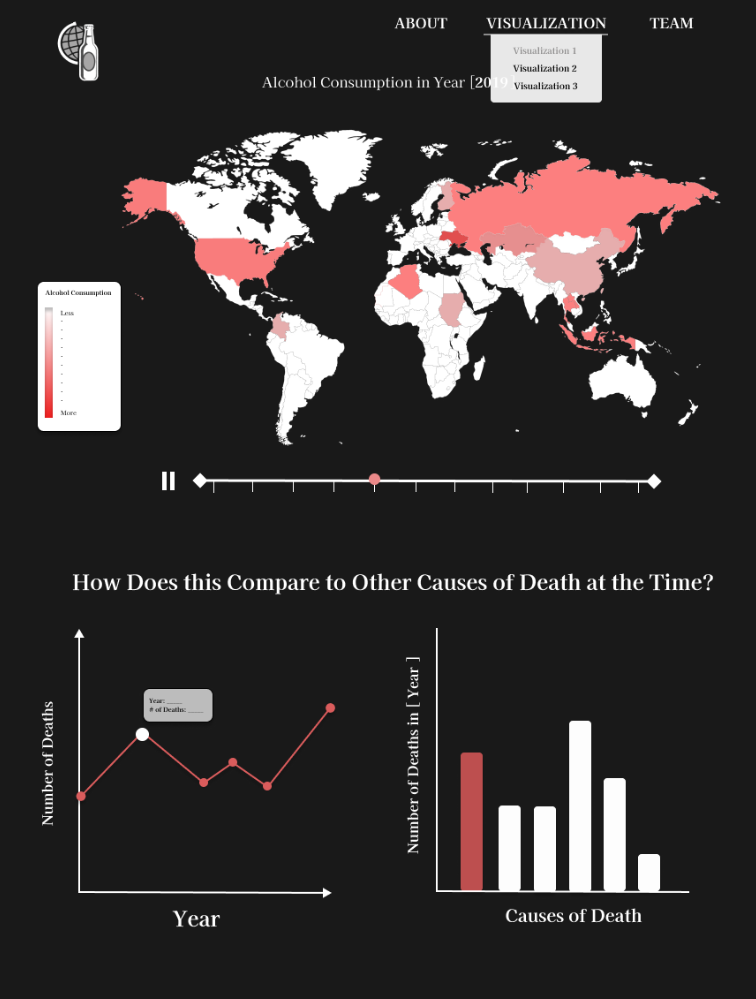
In this visualization, users can observe how alcohol consumption rate (per capita) compares to the number of deaths documented in each country through a slider and two graphs below: A linchart that shows the deathrate across the years, and a bar graph that shows the total alcohol consumption rate across the years. Points that are highlighted in the linechart will be reflected in the bargraph and vice versa. Users can play the slider to which it will go through the data for all the available years (2000 to 2019) and the graphs below will highlight each point and bar for the current year it is being iterated through. Users can also manually drag the slider to compare with specific graphs.
Causes of Death Across Countries with Zooming and Panning
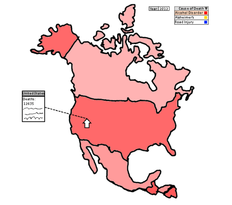
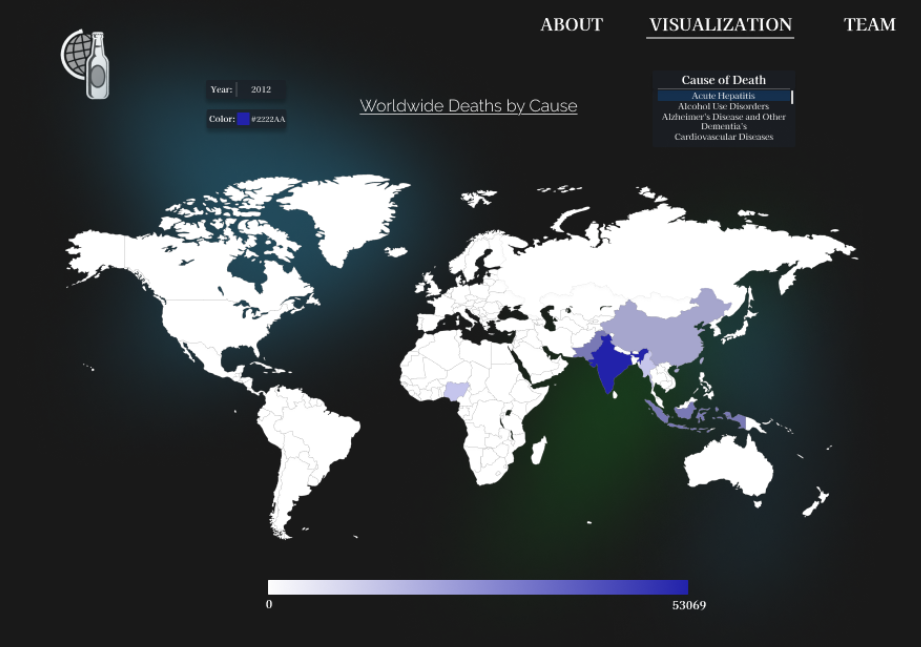
In this visualization, users can observe how an assortment of different causes of death compare across the world per year. They can do this by selecting a year in the "Year:" dropodown menu between 1990 and 2019, one of thirty-one different causes of death from the "Cause of Death:" dropdown, and can change between any RGB color value to display countries in the selected color. The closer the country is to the selected rgb color, the more deaths it has in the selected year by the selected cause. Below the map is a legend container that displays the amount of deaths from the country with the lowest amount of deaths by the selected cause in the selected year (almost always zero), to the country with the highest amount of recorded deaths the selected cause in the selected year. Users can also zoom in and out and move/pan around the map if they want to hover over a country that would typically be hard to hover over due to its small size. When a user hovers over a country, the country's name is displayed alongside the amount of deaths by the selected cause for the selected year.
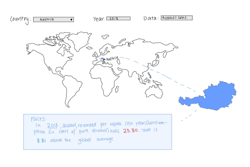
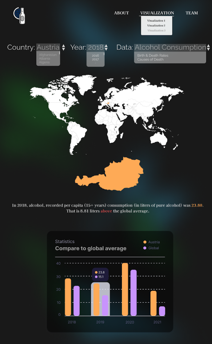
Individual Country Facts and Data
In this visualization, users can select a country and year from two different dropdown menus to display information based on their selected data type. When a country is selected, that country is given an orange color on the map, and then an enlarged version of the colored-in country is displayed below the map. Based on the year and data type they selected, a fact about their selected information is displayed. For example, if a user were to select Austria for the country, 2019 for the year, and Alcohol Consumption for the data type, they would see a message below the highlighted country in a black box that says "In 2019, alcohol, recorded per capita (15+ years) consumption (in liters of pure alcohol) was 11.9".Data Analysis and Cleaning
For the data cleaning we used Python's Panadas library. We combined four datasets: one on causes of death and three on alcohol consumption. For the cause of death data, we cleaned unnecessary columns, filled null cells, added a total count column, and standardized data types. The alcohol consumption datasets were reformatted and aligned, ensuring consistency for merging. After integrating the datasets by year and country. For interaction with the Json of the map, we added alpha-2 countries codes.
Link to data cleaning: Google Colab
Task Analysis
Here are the following tasks that our team prioritized:
- Comparing the alcohol consumption rates to the death rates across different years and countries.
- We tried incorportating this exploration in our brushing and linking, as seen with our first visualization where the user can highlight certain point on either graphs and have it reflected in the other for easier observation.
- The goal was for the user to be able to explore and come up with their own conclusion of the correlation they noticed in the visualization while making it an interactive and engaging experience for users of all backgrounds.
- Observing how different years impact the results of the data collected.
- Our goal was to include a interactive button or slider that allows the user to explore the data for different years in an engaging and user-friendly way. This was implemented in our brushing and linking visualization where the user can play the slider to go through the data for all the available years (2000 to 2019) and the graphs below will highlight each point and bar for the current year it is being iterated through.
- This was also seen with visualization 2 for observing the differences for causes of death across the years, and in visualization 3 for comparing how the chosen year affects the comparison between the chosen country and the world data results.
- Observing how different countries vary in terms of death rates, alcohol consumptions, and leading causes of deaths.
- Each visualization included a world map where, when hovered over, will display some form of data. This was to allow the user to explore the data for different countries and the heatmap of the world map makes it easier and more visually engaging for the user to see the differences between countries.
Design Process
Each team member drafted 2 ideas to contribute, and as a team, we went through all our ideas and chose our top 3 visualizations. After drawing them out more precisely, we decided to incorporate all 3 options into our final project. While working on the visualizations, we've encountered a lot of difficulties with using the D3 library, but eventually figured out how to code out bits and parts of our visualizations.
Visualization 1: Brushing & Linking
Visualization 2: Deaths by Cause with Zooming & Panning
Visualization 3: Individual Country Facts
Conclusion
At the end of our project, we were able to somewhat recreate our top 3 visualization sketches and successfully connected the datasets to our maps and graphs. For visualization 1 (Brushing & Linking), all the main components were implemented, including the timeline slider, the line chart, and the bar graph -- However, the style for the slider and legend was a bit off from the original sketch. It also got a bit messy when figuring out how to connected the slider to the map, line chart, and bar graph. Visualization 2 (Causes of Death Across Countries with Zooming and Panning) was also implemented with the map, dropdowns, and legend, and closley matched the original sketch. The programmer for visualization 2 also added the ability to zoom in and out, making the map more interactive. But although interactive, the layout of the page can vary depending on the size of the screen which may lead to inconsistencies with objects overlapping. In visualization 3, it also uses the map and dropdowns for the user to select a country and year, and displayed the data below the map. And similar to visualization 3, the layout of the page can vary depending on the size of the screen or browser (as noticed by one of our team member). Our UI was also close to how we had envisioned in our sketches, but we also realized that the background can make reading the map a bit more challenging so we'll take that into acount for future projects. Overall, the created project was a big sucess, but there are definitely still areas for improvement.
Acknowledgments
- D3: Data-Driven Documents by Mike Bostock.
- Let's Make a Map by Mike Bostock
- Pure CSS responsive "Fork me on GitHub" ribbon by Chris Heilmann.
- infoVizGroup8 by TA Aby and Team 8 (From 2023)
- COSI 116A - Homework 4 - Brushing and Linking
- Downloadable GeoJSON
- Dataset for Alcohol Consumption Rate (Liters per Capita) by The World Health Organization
- Dataset for Causes of Deathes Around the World by Sourav Banerjee
- Dataset for Global Births and Deaths Projections by Shreya Sur965